PIE CHART
ตัวอย่างการเขียนวิเคราะห์กราฟวงกลม writing task 1
The charts show the percentage of people working in different sectors in town A and town B in two years, 1960 and 2010.
Summarize the information by selecting and reporting the main features, and make comparisons where relevant.
The pie charts illustrate the ratio of residents who are working in different sorts of professions in city A and city B over the period of five decades.
Generally, in 1960, the vast majority of workers in both town A and town B worked in field of services. Meanwhile, in 2000 residents in town A highly favored working for manufacturing; however, people in town B still worked in services sector.
To begin with, more than two fifths of people in town A worked for services in the earliest year, which was twenty-one per cent higher than that of 2010. Furthermore, sales sector was the second most popular among natives which was responsible for just below a third (30%) in 1960, whereas the figure had a significant drop to 16% in the next 50 years. Surprisingly, manufacturing career was the most desirable in 2010, which accounted for a sizable 64 per cent and 35% lower than in 1960.
Turning to town B, it is lucid that the percentage of employees who worked for services moderately declined from seven in ten to about a half in the year of 1960 and 2010, respectively. Besides, the ratio of sales workers were slightly similar in both years, which formed 20% and 22%, in turn. Nevertheless, just 10 per cent of people worked in manufacturing field in 1960 and its percentage increased dramatically to more than one fifth.


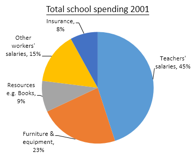
The three pie charts below show the changes in annual spending by a particular UK school in 1981, 1991 and 2001.
Summaries the information by selecting and reporting thee main features, and make comparisons where relevant.
The pie charts compare changing pattern of yearly expenditure of a certain school in England over the period of two decades.
Overall, there were three sorts of expenditure which had slightly increased, two types of expenses had a minimal drop over the period of time scale. It is clear that academic staff income had the largest proportion, while the least was obtained by insurance factor.
To begin with, instructors’ revenues represented at two fifths at the beginning of the period before growing to a half, after which it had a slight decline to a sizeable forty five per cent in 2001. Besides, there was a minimal rise in insurance between 1981 and 1991, which showed from 2% to 3% before increasing to 8% in 2001. Surprisingly, furniture and equipment had more than one in ten in 1981.This was followed by a significant decrease threefold before going up by 18% in the last year
Turning to a downward trend, starting with other employees’ salaries which had the second highest share in the beginning; however, its percentage noticeably dropped by a paltry 13%. Aside from that change, books materials stood at less than one fifth, and, its transition dipped to less than 10% at the end.


The pie charts below show the comparison of different kinds of energy production of France in two years.
The figures depict the ratio of sources for energy production in the country of France in the year 1995 and 2005.
Generally, petrol, gas and coal had the highest share in the earliest year; however, in the next a decade, petrol become the third most popular among others. Nuclear and the others had a minimal share in both years.
To begin with, coal was the most common source to produce energy, which was accounted for almost 30% in the earliest year before increasing to roughly a third in 2005 and it remained the highest proportion among the others. Turning to gas, its ratio stood at about 29.60% which had the second largest contribution in 1995, after which it slightly grew up to 30.31% in 2005. Furthermore, 29.27% was produced using oil resources in 2005; nevertheless, its figure dropped minimally more than one-ten in the next one decade.
With regards to the remaining methods of producing energy, in 1995, there was a paltry 6.40 per cent and a mere 4.90 per cent from nuclear and others, in turn. After ten years, the former rose slightly by 3.7%, whereas the latter grew up roughly twofold in 2005.

The two pie charts below show the online shopping sales for retail sectors in Canada in 2005 and 2010.
Summaries the information by selecting and reporting the main features, and make comparisons where relevant.
The pie charts depicts four retail categories which were sold through online channel in the country of Canada in the years 2005 and 2010.
Overall, electronic gadgets and appliance were highly favored in Canada for both years. Although home furniture was the second most famous product, it was overtaken by food and beverage after 5 years
As is shown in the illustration, the overwhelming majority of sales was in electronics and tools which stood at more than a third. However, its ratio has a small decrease by five per cent in 2010. Besides, a quarter of sales proportion was responsible for home furnishings in 2005, after which it declined by 10% in the next five years. Turning to food and drinks consumption, its figure had a noticeable growth from more than one fifth to almost a third in 2005 to 2010, respectively. Furthermore, Canadian sold video games via online video games as the least in 2005 before going up to 23% in 2010.
