BAR CHART PRACTICES

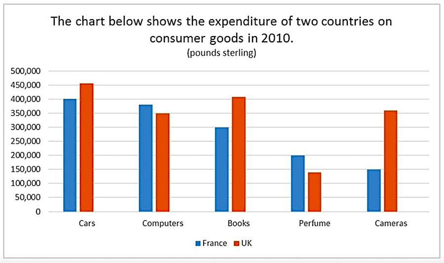
The chart illustrates the amount of money spent on five consumer goods (cars, computers, books, perfume and cameras) in France and the UK in 2010. Units are measured in pounds sterling.
Summarize the information by selecting and reporting the main features, and make comparisons where relevant.

The chart shows the percentage of man and women living in poverty divided ten different age groups in the United States in 2008.
Summarize the information by selecting and reporting the main features, and make comparisons where relevant.

The chart shows the percentage of males and females who were overweight in Australia from 1980 to 2010.
Summarize the information by selecting and reporting the main features, and make comparisons where relevant.


The bar chart shows the percentage of expected city visits by country of origin for 2018 (Thousands/year)
Summarize the information by selecting and reporting the main features, and make comparisons where relevant.
The bar graph below shows the proportion of renewable energy of the total supply in 2000, 2004 and 2007.
Summarize the information by selecting and report in the main features, and make comparisons where relevant.

