PIE CHART PRACTICES

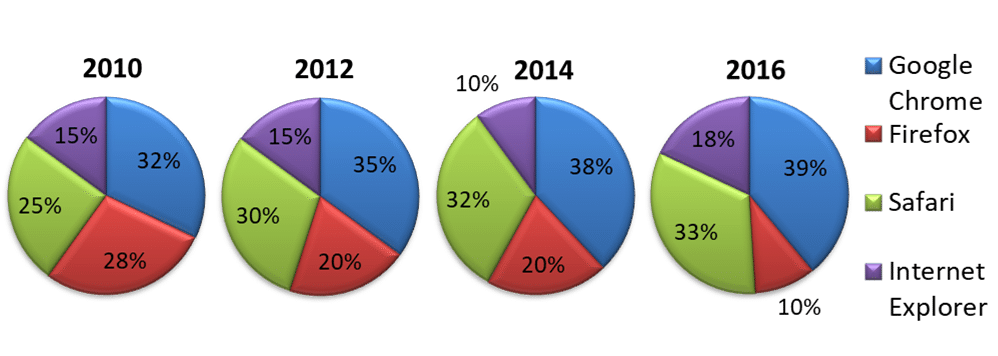
The pie charts below give information about internet browser use over a period of eight years.
Summarize the information by selecting and reporting the main features and making comparisons where relevant.

The charts below provide information on popular modes of transport in the city of Cambridge for the years 2008 and 2018.
Summarize the information by selecting and reporting the main features and make comparisons where relevant.

The three pie charts below show the changes in annual spending by a particular UK school in 1981,1991 and 2001.
Summarize the information by selecting and reporting the main features, and make comparisons where relevant.

The charts below show household spending patterns in two countries between 1980 and 2008.
Summarize the information by selecting and reporting the main features, and make comparisons where relevant.

The pie chart below shows the production costs and expenses for making a movie.
Summarize the information by selecting and reporting the main features and making comparisons where relevant.
